

the brief
FROM BRUSHSTROKE TO SYSTEM
The original mark was a hand-painted swirl, expressive, textured, full of character at large sizes. It needed a version that could hold up as a favicon, an app icon, and a social avatar without losing what made it feel like Entropy.
THe problem
TEXTURE DOESN'T SCALE DOWN
The brushstroke's frayed edges and tapering strokes read as intentional at poster size, but broke down into noise at 32px. A mark that lives across web, social, and print needs to survive both ends of that range.
the insight
KEEP THE GESTURE, LOSE THE GRAIN
The swirl itself, the tightening spiral with the open inner curl, was already the right idea. Rebuilding it as a clean, continuous geometric form kept that same motion and read, just without the texture working against it at small sizes.
the brief
A warm café, built to scale
Amber Grounds is a café concept inspired by global flavours and relaxed comfort. The identity had to feel modern and approachable while signalling genuine craftsmanship, scalable across future locations.
THe problem
Standing apart from
artisan café
The category is saturated. The brand needed to signal global integration and multi-location scale, without losing the warmth that makes a café feel personal at point of purchase.
the insight
Crown and globe,
resolved as one
The crown-and-globe motif could carry real dual meaning, hospitality and global flavour, but only once resolved into a single ownable mark rather than a literal illustration.
WARM, MODERN, ROOTED IN CRAFT
ONE OWNABLE SYMBOL
LEGIBLE IN LIGHT & DARK
SCALABLE ACROSS PRINT, PACKAGING, SIGNAGE
CLEAN AT ANY SIZE
SAME CORE GESTURE
SHARPER WORDMARK
CONSISTENT identity
Logo, pattern, colour, and type
01 logo


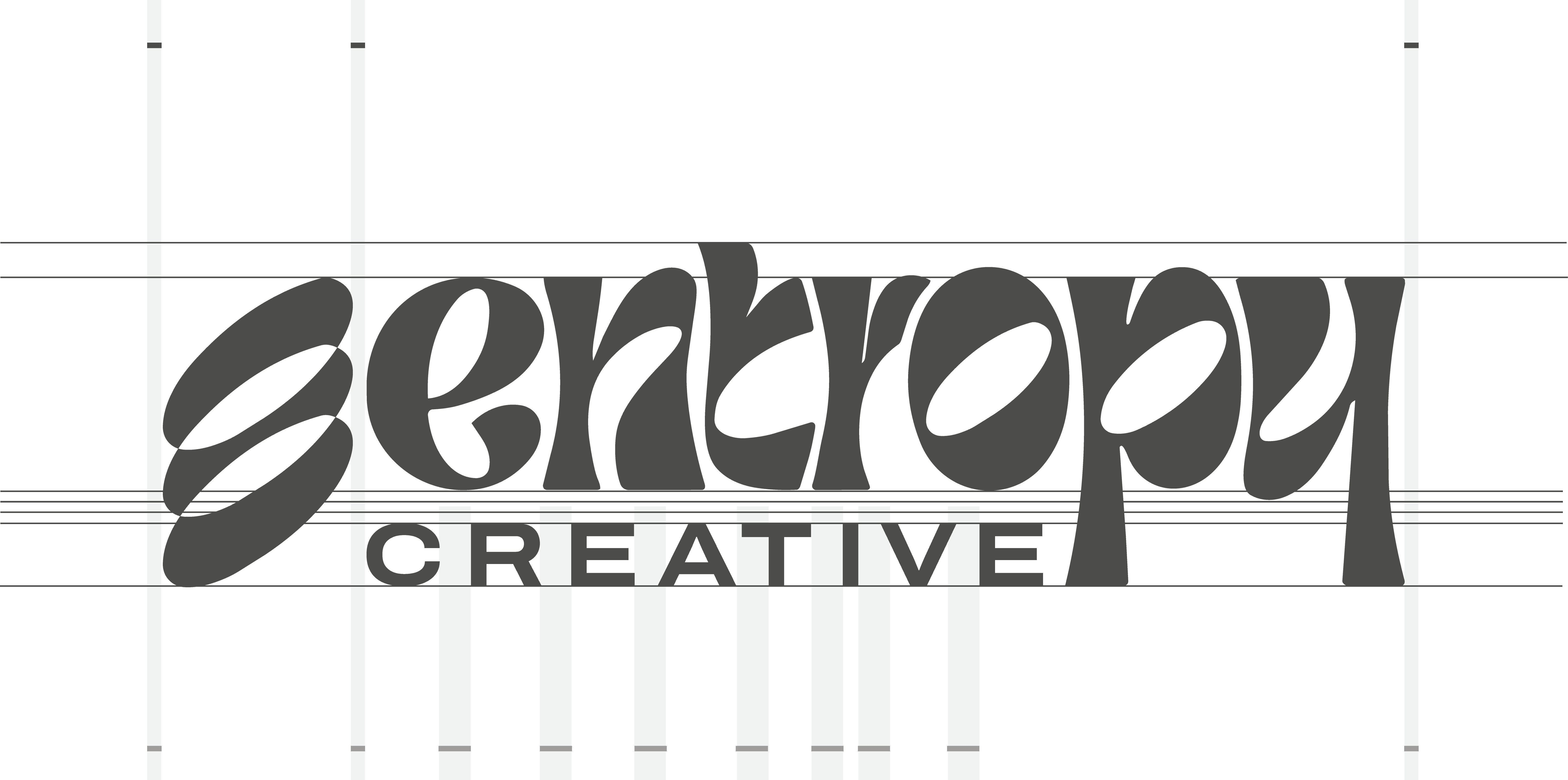
The brushstroke swirl was rebuilt as a single continuous geometric form, same spiral motion and open inner curl, without the frayed edges that broke down at small sizes. The "entropy" wordmark shifted slightly in weight and spacing to match that cleaned-up confidence, paired with "CREATIVE" in a steadier caps treatment underneath.
02 COLOUR


Unchanged from the existing system. Light Purple and Burnt Orange carry the contrast, with Midnight, Off-White, and Near-Black holding the weight across decks and web.
03 pattern

Unchanged. The unwinding line motif continues as the brand's supporting texture, no changes needed alongside the mark refresh.
04 TYPOGRAPHY

ARCHIVO EXPANDED - HEADLINES

FreightBig Pro - emphasis

ARCHIVO - long-form copy
Unchanged. Archivo Expanded, Freight Big Pro, and Archivo regular carry the same roles across headlines, emphasis, and body copy.
touchpoints
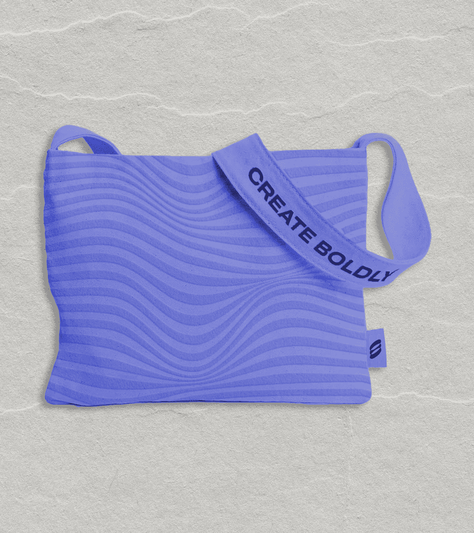
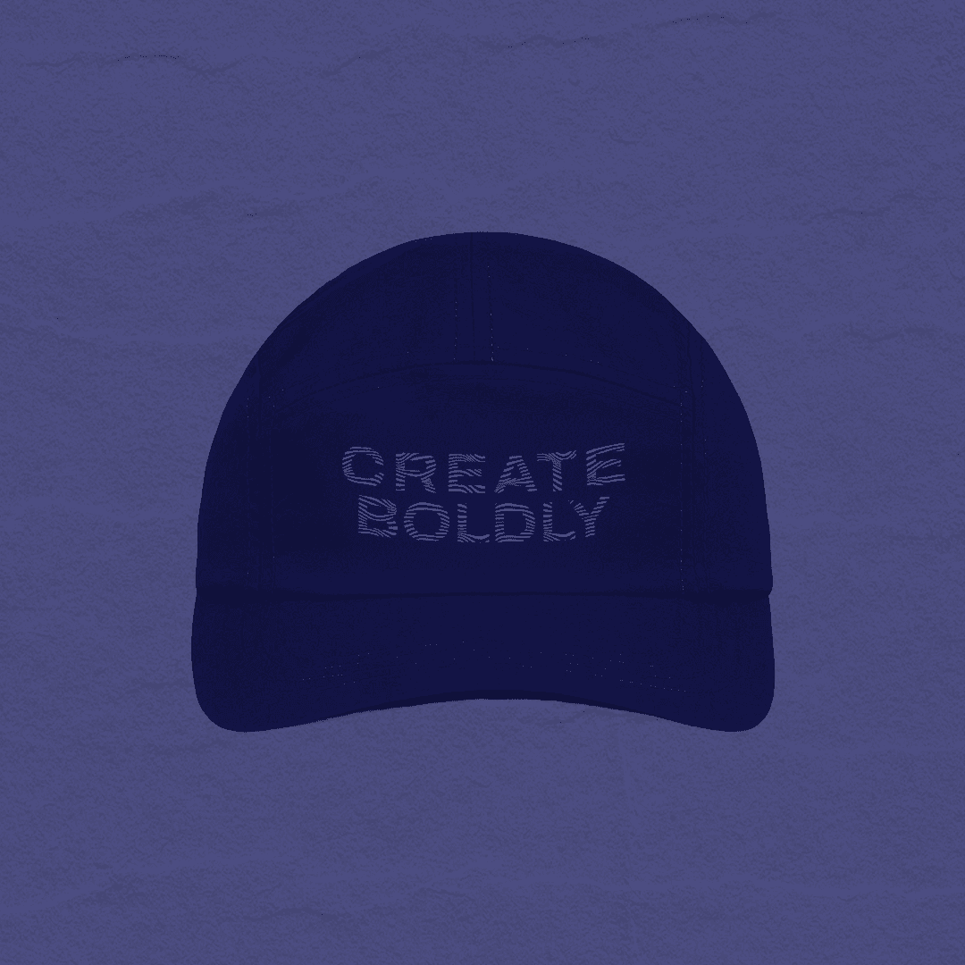
05 APPLIED ACROSS TOUCHPOINTS







the brief
FROM BRUSHSTROKE TO SYSTEM
The original mark was a hand-painted swirl, expressive, textured, full of character at large sizes. It needed a version that could hold up as a favicon, an app icon, and a social avatar without losing what made it feel like Entropy.
THe problem
TEXTURE DOESN'T SCALE DOWN
The brushstroke's frayed edges and tapering strokes read as intentional at poster size, but broke down into noise at 32px. A mark that lives across web, social, and print needs to survive both ends of that range.
the insight
KEEP THE GESTURE, LOSE THE GRAIN
The swirl itself, the tightening spiral with the open inner curl, was already the right idea. Rebuilding it as a clean, continuous geometric form kept that same motion and read, just without the texture working against it at small sizes.
the brief
A warm café, built to scale
Amber Grounds is a café concept inspired by global flavours and relaxed comfort. The identity had to feel modern and approachable while signalling genuine craftsmanship, scalable across future locations.
THe problem
Standing apart from
artisan café
The category is saturated. The brand needed to signal global integration and multi-location scale, without losing the warmth that makes a café feel personal at point of purchase.
the insight
Crown and globe,
resolved as one
The crown-and-globe motif could carry real dual meaning, hospitality and global flavour, but only once resolved into a single ownable mark rather than a literal illustration.
WARM, MODERN, ROOTED IN CRAFT
ONE OWNABLE SYMBOL
LEGIBLE IN LIGHT & DARK
SCALABLE ACROSS PRINT, PACKAGING, SIGNAGE
CLEAN AT ANY SIZE
SAME CORE GESTURE
SHARPER WORDMARK
CONSISTENT identity
Logo, pattern, colour, and type
01 logo
The brushstroke swirl was rebuilt as a single continuous geometric form, same spiral motion and open inner curl, without the frayed edges that broke down at small sizes. The "entropy" wordmark shifted slightly in weight and spacing to match that cleaned-up confidence, paired with "CREATIVE" in a steadier caps treatment underneath.
02 COLOUR
Unchanged from the existing system. Light Purple and Burnt Orange carry the contrast, with Midnight, Off-White, and Near-Black holding the weight across decks and web.
03 pattern
Unchanged. The unwinding line motif continues as the brand's supporting texture, no changes needed alongside the mark refresh.
04 TYPOGRAPHY
ARCHIVO EXPANDED - HEADLINES
FreightBig Pro - emphasis
ARCHIVO - long-form copy
Unchanged. Archivo Expanded, Freight Big Pro, and Archivo regular carry the same roles across headlines, emphasis, and body copy.
touchpoints
05 APPLIED ACROSS TOUCHPOINTS