
0.2.print design
If you're spoilers person like I am, here's what you can expect on this page: exciting. layouts. That's all I'll say.
print de·sign
/prɪnt dɪˈzaɪn/
noun
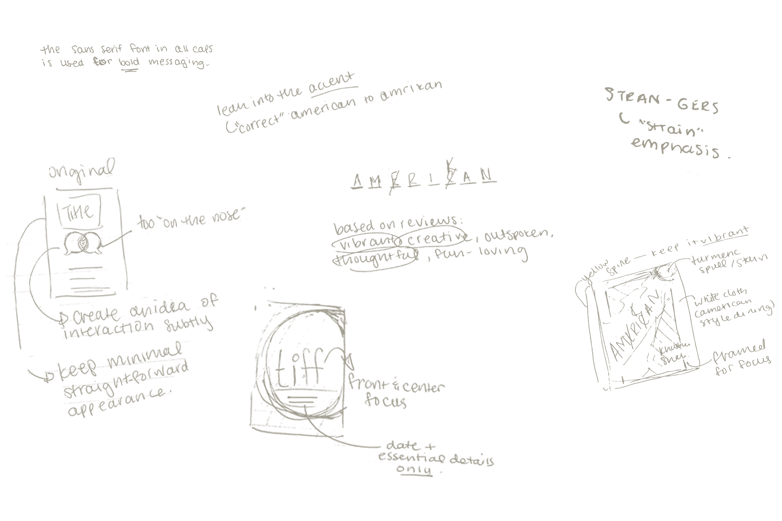
Print design is the craft of creating tangible visual materials—such as books, packaging, posters, and editorial layouts—where typography, composition, and materiality come together to communicate with clarity and presence.
“Her portfolio treats print design as a tactile experience, balancing thoughtful layouts and refined production details to create lasting physical impact.”

project overview
0.2.1. ENTROPY CREATIVE MERCHANDISE
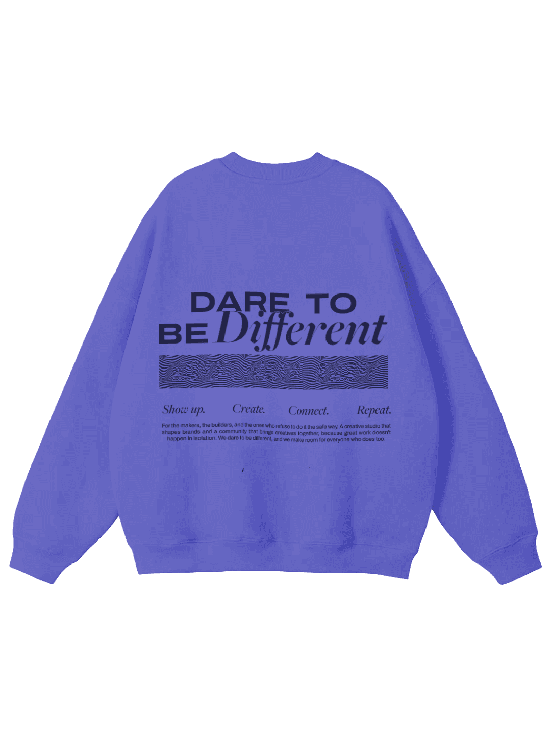
For Entropy Creative, merch became another surface for the brand system, not an afterthought. Each piece runs the same 'Dare to Be Different' back print hierarchy, headline lockup, wave pattern block, tagline, and body copy, while 'Create Boldly' carries the identity on the bag and cap. Across the hoodie, tee, crewneck, tote, and cap, colour and scale shift by role, from the hoodie's full statement to the cap's single line, but the system never breaks.
project type
Merchandise
year
2026
0.2.1. ENTROPY CREATIVE MERCHANDISE
For Entropy Creative, merch became another surface for the brand system, not an afterthought. Each piece runs the same 'Dare to Be Different' back print hierarchy, headline lockup, wave pattern block, tagline, and body copy, while 'Create Boldly' carries the identity on the bag and cap. Across the hoodie, tee, crewneck, tote, and cap, colour and scale shift by role, from the hoodie's full statement to the cap's single line, but the system never breaks.
project type
Merchandise
year
2026






project overview
0.2.1. BOOK COVER STUDIES
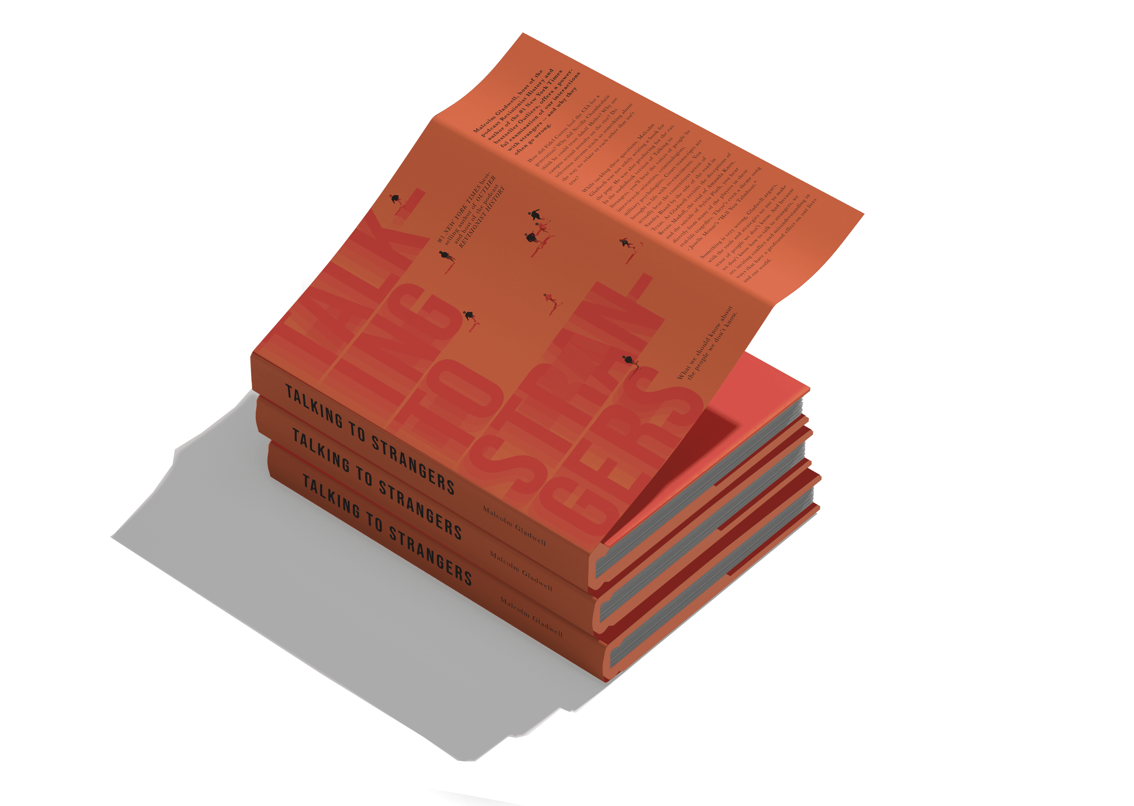
The Book Cover Studies explore distinct visual languages unified by a disciplined approach to hierarchy, concept, and restraint. Each cover balances typography and imagery to create strong shelf presence while maintaining narrative depth. Through scale, contrast, and intentional negative space, the designs prioritise clarity at both physical and thumbnail size. The series functions as a study in tension and readability, where minimal palettes, texture, and structured layouts translate story into form.
project type
Editorial
year
2026
0.2.1. BOOK COVER STUDIES
The Book Cover Studies explore distinct visual languages unified by a disciplined approach to hierarchy, concept, and restraint. Each cover balances typography and imagery to create strong shelf presence while maintaining narrative depth. Through scale, contrast, and intentional negative space, the designs prioritise clarity at both physical and thumbnail size. The series functions as a study in tension and readability, where minimal palettes, texture, and structured layouts translate story into form.
project type
Editorial
year
2026




project overview
0.2.3. THE B/W SERIES
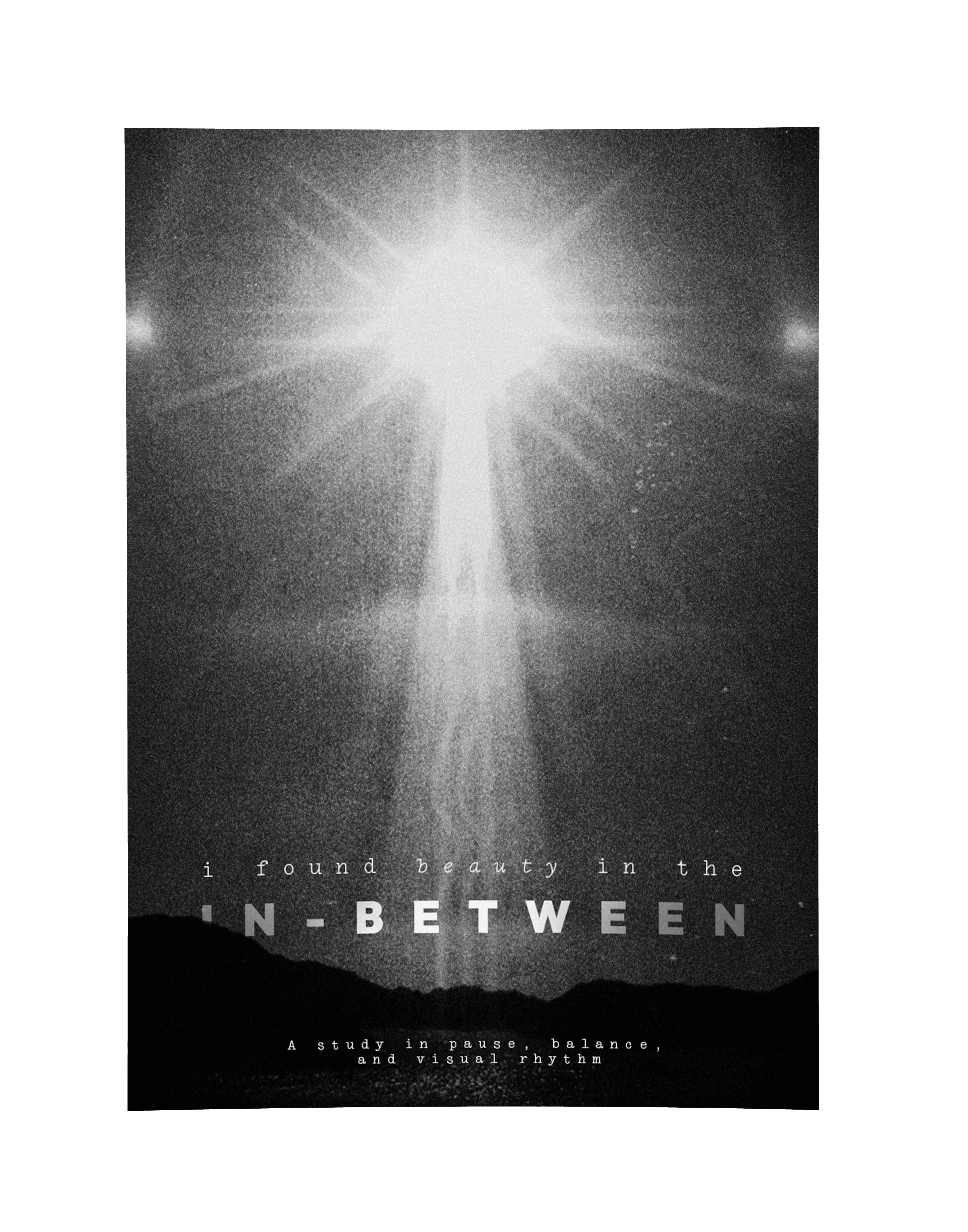
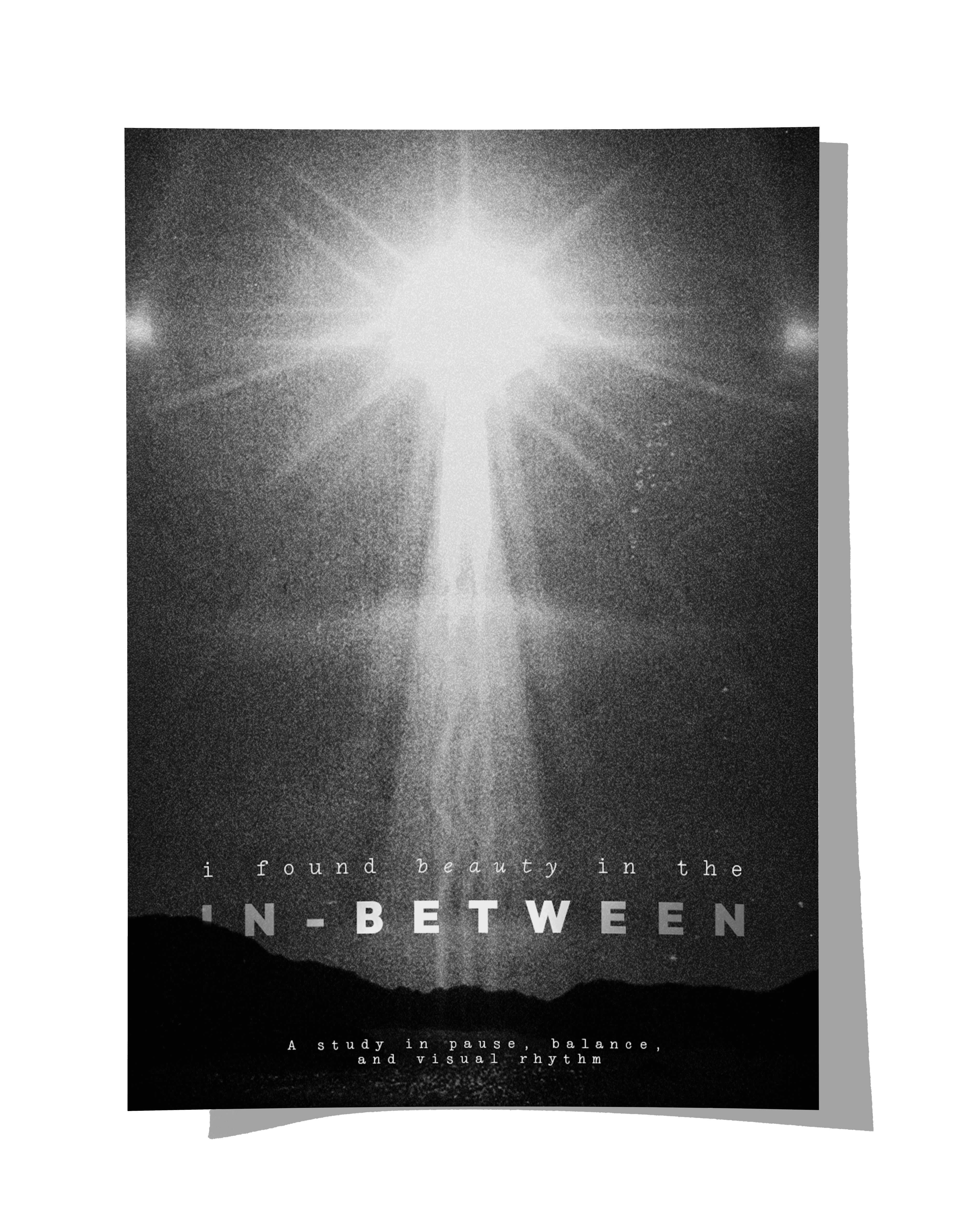
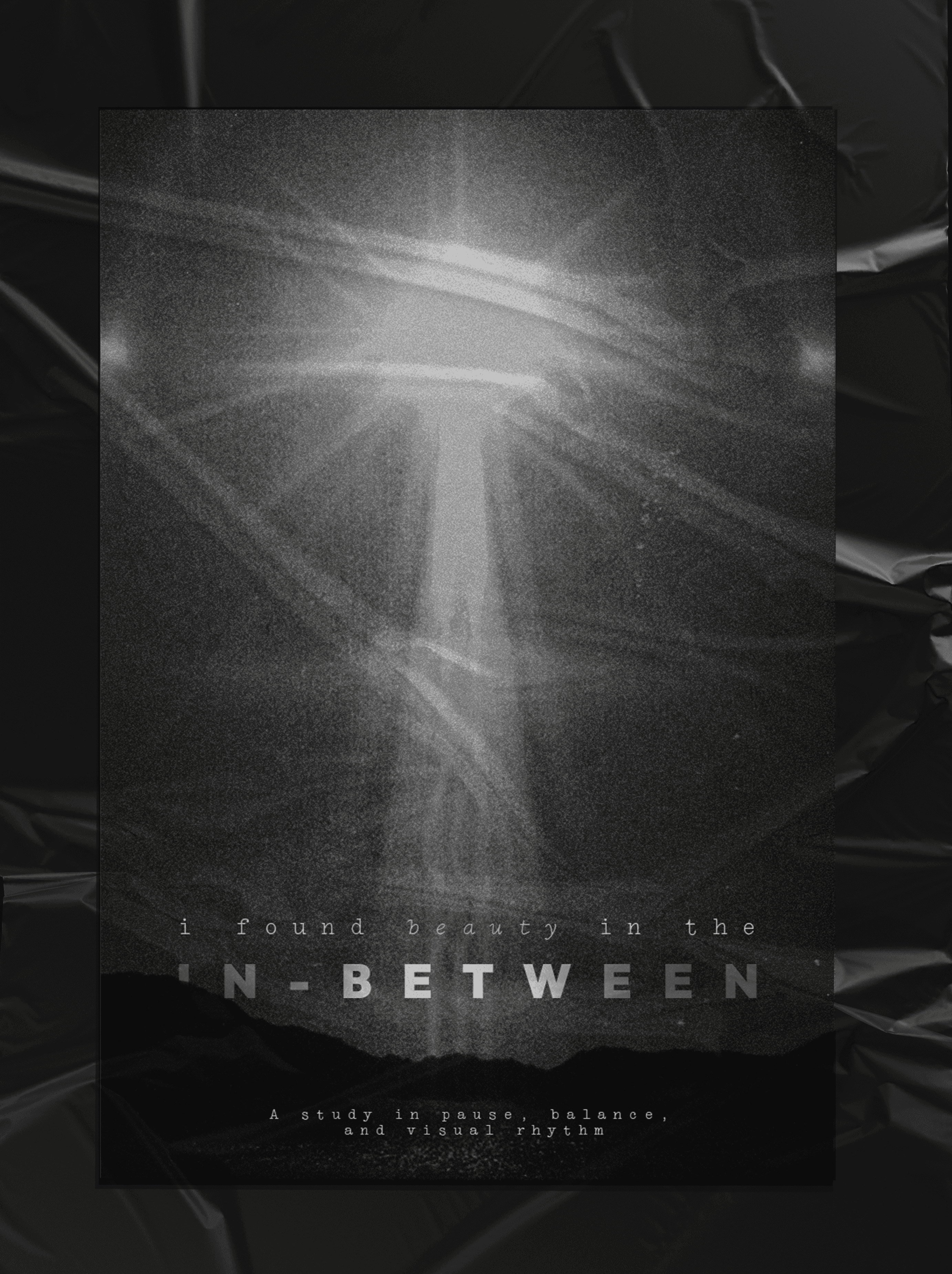
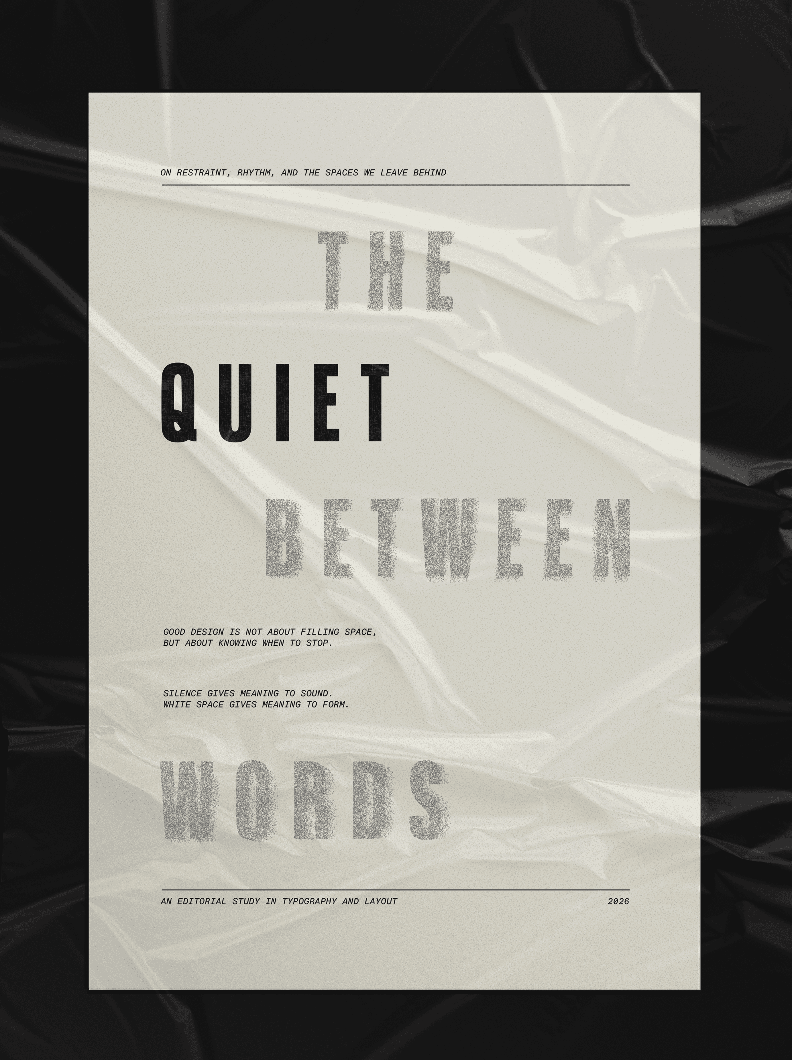
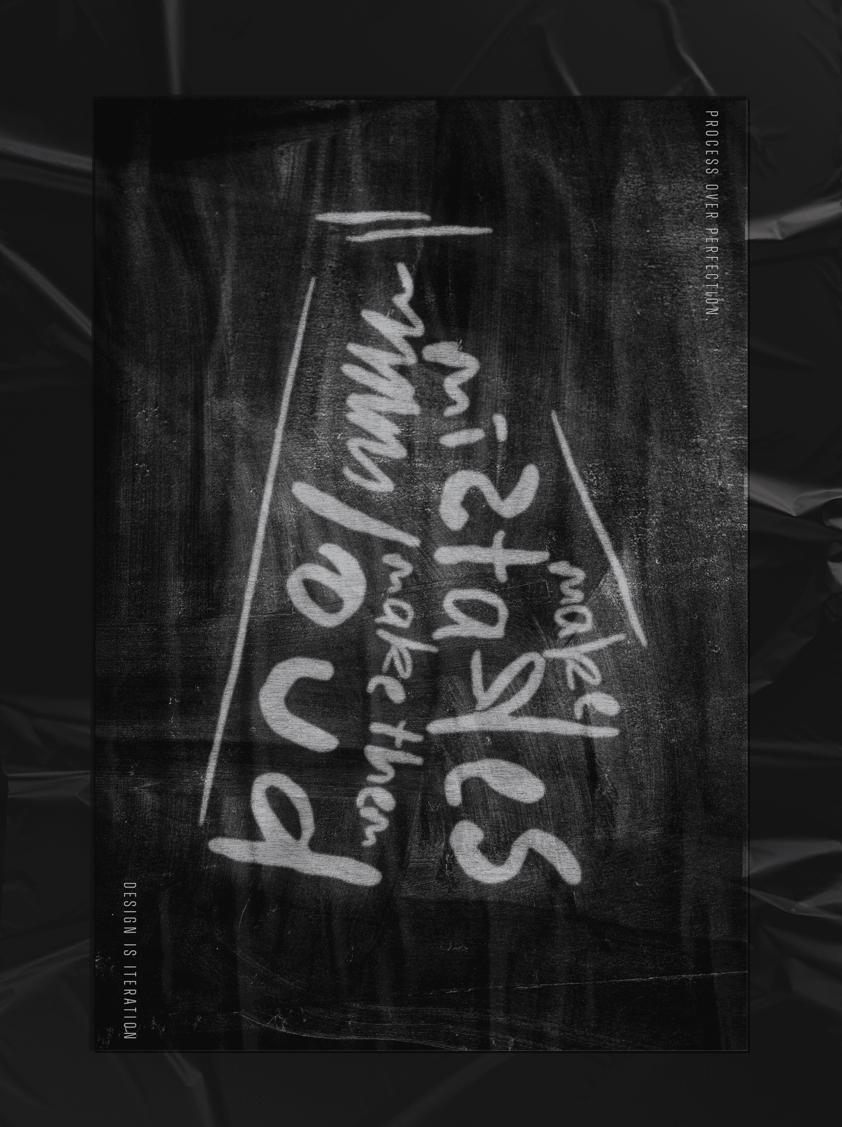
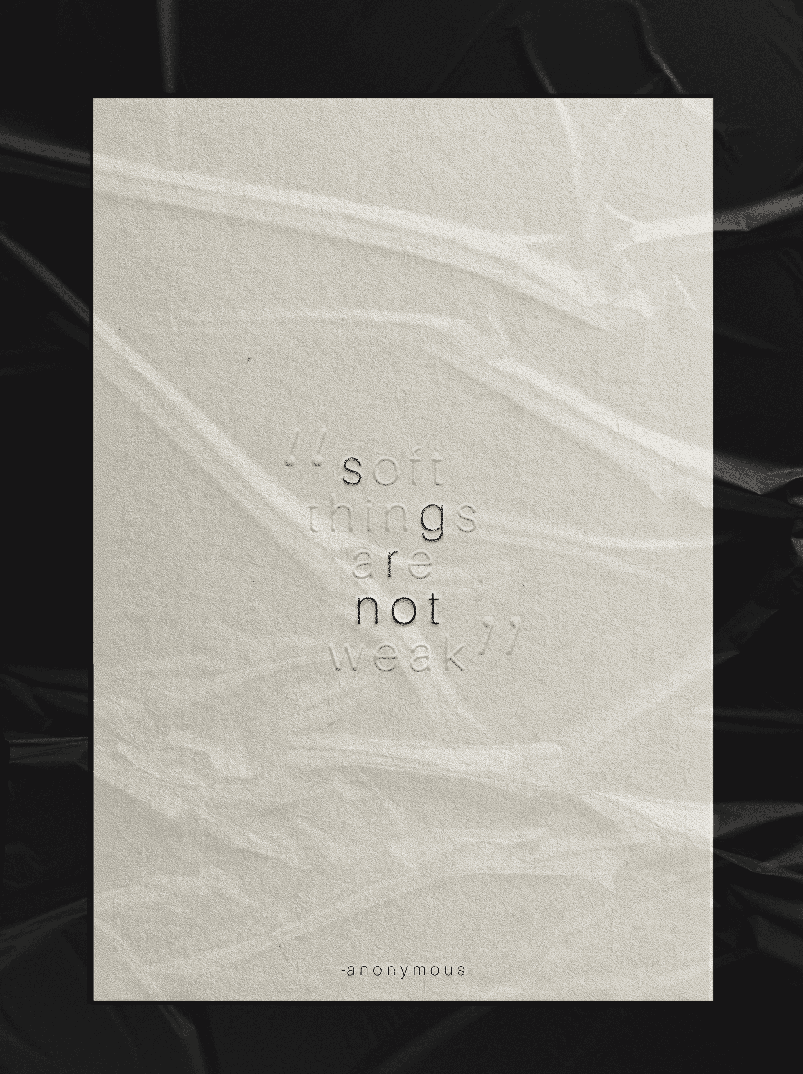
The B/W Series explores hierarchy and restraint through contrast, texture, and negative space. Using scale shifts, grain, and subtle embossing effects, each poster balances softness with structure to create tension without colour. Together, the series becomes a study in pause, proportion, and the power of limitation.
project type
Poster Design
year
2026
0.2.3. THE B/W SERIES
The B/W Series explores hierarchy and restraint through contrast, texture, and negative space. Using scale shifts, grain, and subtle embossing effects, each poster balances softness with structure to create tension without colour. Together, the series becomes a study in pause, proportion, and the power of limitation.
project type
Poster Design
year
2026

0.2.print design
If you're spoilers person like I am, here's what you can expect on this page: exciting. layouts. That's all I'll say.
print de·sign
/prɪnt dɪˈzaɪn/
noun
Print design is the craft of creating tangible visual materials—such as books, packaging, posters, and editorial layouts—where typography, composition, and materiality come together to communicate with clarity and presence.
“Her portfolio treats print design as a tactile experience, balancing thoughtful layouts and refined production details to create lasting physical impact.”
project overview
0.2.1. ENTROPY CREATIVE MERCHANDISE
For Entropy Creative, merch became another surface for the brand system, not an afterthought. Each piece runs the same 'Dare to Be Different' back print hierarchy, headline lockup, wave pattern block, tagline, and body copy, while 'Create Boldly' carries the identity on the bag and cap. Across the hoodie, tee, crewneck, tote, and cap, colour and scale shift by role, from the hoodie's full statement to the cap's single line, but the system never breaks.
project type
Merchandise
year
2026
0.2.1. ENTROPY CREATIVE MERCHANDISE
For Entropy Creative, merch became another surface for the brand system, not an afterthought. Each piece runs the same 'Dare to Be Different' back print hierarchy, headline lockup, wave pattern block, tagline, and body copy, while 'Create Boldly' carries the identity on the bag and cap. Across the hoodie, tee, crewneck, tote, and cap, colour and scale shift by role, from the hoodie's full statement to the cap's single line, but the system never breaks.
project type
Merchandise
year
2026
project overview
0.2.1. BOOK COVER STUDIES
The Book Cover Studies explore distinct visual languages unified by a disciplined approach to hierarchy, concept, and restraint. Each cover balances typography and imagery to create strong shelf presence while maintaining narrative depth. Through scale, contrast, and intentional negative space, the designs prioritise clarity at both physical and thumbnail size. The series functions as a study in tension and readability, where minimal palettes, texture, and structured layouts translate story into form.
project type
Editorial
year
2026
0.2.1. BOOK COVER STUDIES
The Book Cover Studies explore distinct visual languages unified by a disciplined approach to hierarchy, concept, and restraint. Each cover balances typography and imagery to create strong shelf presence while maintaining narrative depth. Through scale, contrast, and intentional negative space, the designs prioritise clarity at both physical and thumbnail size. The series functions as a study in tension and readability, where minimal palettes, texture, and structured layouts translate story into form.
project type
Editorial
year
2026
project overview
0.2.3. THE B/W SERIES
The B/W Series explores hierarchy and restraint through contrast, texture, and negative space. Using scale shifts, grain, and subtle embossing effects, each poster balances softness with structure to create tension without colour. Together, the series becomes a study in pause, proportion, and the power of limitation.
project type
Poster Design
year
2026
0.2.3. THE B/W SERIES
The B/W Series explores hierarchy and restraint through contrast, texture, and negative space. Using scale shifts, grain, and subtle embossing effects, each poster balances softness with structure to create tension without colour. Together, the series becomes a study in pause, proportion, and the power of limitation.
project type
Poster Design
year
2026