

the brief
A SEASIDE BRAND, QUIETLY LUXURIOUS
SE.RE'NA.TA is a seaside destination brand blending retro refinement with modern minimalism. The identity needed to feel calm, rhythmic, and quietly luxurious, built around a visual system inspired by musical structure.
THe problem
RESTRAINT OVER DECORATION
The brand had to convey luxury, heritage, and coastal atmosphere without falling into predictable nautical, resort, or destination-hotel visual language. It needed to feel genuinely authored, restrained where others are decorative.
the insight
PUNCTUATION AS NOTATION
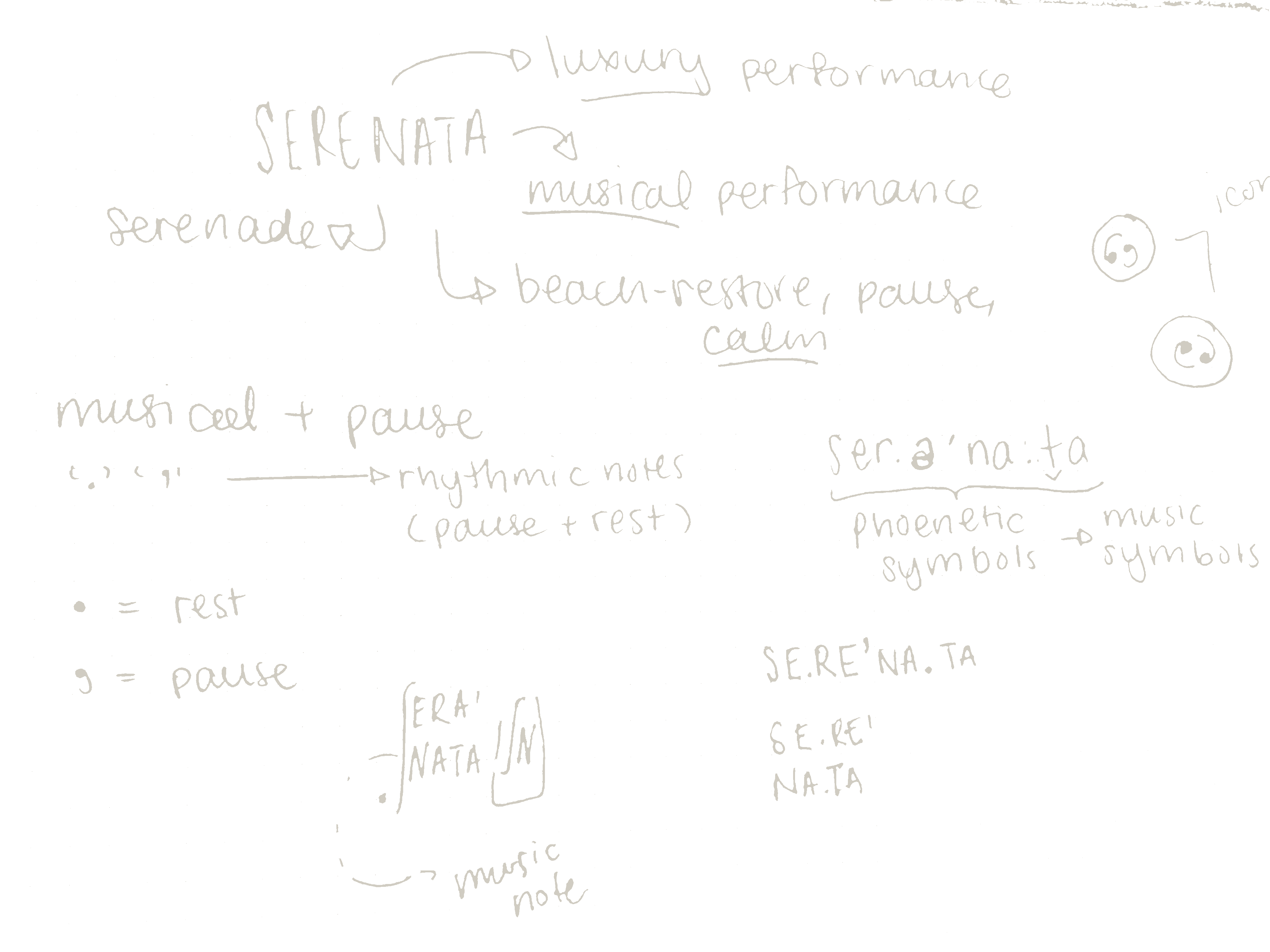
SE.RE'NA.TA takes its name from "serenade," a musical performance carrying connotations of luxury and quiet ceremony. The period and apostrophe marking pronunciation double as musical notation: a rest, a pause. The same marks that teach you to say the word also set its rhythm, echoing the calm, restorative pace of the beach itself.
WARM, MODERN, ROOTED IN CRAFT
ONE OWNABLE SYMBOL
LEGIBLE IN LIGHT & DARK
SCALABLE ACROSS PRINT, PACKAGING, SIGNAGE
NAME AS MARK
LYRICAL RESTRAINT
BUILT FOR COASTAL LUXURY
NO ILLUSTRATION NEEDED,
Logo, pattern, colour, and type
01 logo


Warm terracotta and amber against soft cream, grounded by espresso and near-black. Forest green sits apart, reserved for single-origin releases so the everyday line stays unmistakably Amber Grounds.
02 COLOUR


Crown and globe fused into one continuous form, read together with the wordmark. It holds up small on a cup sleeve or large on a storefront window, no supporting icon required.
The period and apostrophe within SE.RE'NA.TA function as both pronunciation guide and musical notation, rest and pause. Read together, the punctuation carries the full identity, requiring no supporting icon or illustration.
A warm, coastal palette grounded in restraint: soft slate, sand, cream, and deep rust-brown, evoking shoreline light without leaning into cliché resort tones.
04 TYPOGRAPHY

norman — headlines

proxima nova — body
A rounded geometric display face for warmth and modernity, set against a sturdier slab serif that grounds it and keeps longer copy legible at small sizes.
03 pattern

The logomark paired with a companion sunburst, repeated in a simple grid. Reads as texture from a distance, as brand detail up close, consistent across bags, cups, and coasters.
A single serif carries both the mark and the body copy, chosen for its warmth and legibility across light and dark applications, holding the same lyrical, intimate tone the brand is built on.
Built from the same punctuation as the logo. The comma and period repeat and rotate into a quiet, rhythmic motif, extending the notation concept across every application without ever illustrating the coast directly.
touchpoints
05 beach house touchpoints


06 beach house purchases



the brief
A SEASIDE BRAND, QUIETLY LUXURIOUS
SE.RE'NA.TA is a seaside destination brand blending retro refinement with modern minimalism. The identity needed to feel calm, rhythmic, and quietly luxurious, built around a visual system inspired by musical structure.
THe problem
RESTRAINT OVER DECORATION
The brand had to convey luxury, heritage, and coastal atmosphere without falling into predictable nautical, resort, or destination-hotel visual language. It needed to feel genuinely authored, restrained where others are decorative.
the insight
PUNCTUATION AS NOTATION
SE.RE'NA.TA takes its name from "serenade," a musical performance carrying connotations of luxury and quiet ceremony. The period and apostrophe marking pronunciation double as musical notation: a rest, a pause. The same marks that teach you to say the word also set its rhythm, echoing the calm, restorative pace of the beach itself.
WARM, MODERN, ROOTED IN CRAFT
ONE OWNABLE SYMBOL
LEGIBLE IN LIGHT & DARK
SCALABLE ACROSS PRINT, PACKAGING, SIGNAGE
NAME AS MARK
LYRICAL RESTRAINT
BUILT FOR COASTAL LUXURY
NO ILLUSTRATION NEEDED,
Logo, pattern, colour, and type
01 logo
Warm terracotta and amber against soft cream, grounded by espresso and near-black. Forest green sits apart, reserved for single-origin releases so the everyday line stays unmistakably Amber Grounds.
02 COLOUR
Crown and globe fused into one continuous form, read together with the wordmark. It holds up small on a cup sleeve or large on a storefront window, no supporting icon required.
The period and apostrophe within SE.RE'NA.TA function as both pronunciation guide and musical notation, rest and pause. Read together, the punctuation carries the full identity, requiring no supporting icon or illustration.
A warm, coastal palette grounded in restraint: soft slate, sand, cream, and deep rust-brown, evoking shoreline light without leaning into cliché resort tones.
04 TYPOGRAPHY
norman — headlines
proxima nova — body
A rounded geometric display face for warmth and modernity, set against a sturdier slab serif that grounds it and keeps longer copy legible at small sizes.
03 pattern
The logomark paired with a companion sunburst, repeated in a simple grid. Reads as texture from a distance, as brand detail up close, consistent across bags, cups, and coasters.
A single serif carries both the mark and the body copy, chosen for its warmth and legibility across light and dark applications, holding the same lyrical, intimate tone the brand is built on.
Built from the same punctuation as the logo. The comma and period repeat and rotate into a quiet, rhythmic motif, extending the notation concept across every application without ever illustrating the coast directly.
touchpoints
05 beach house touchpoints
06 beach house purchases