


the brief
ONE TITLE, TWO WAYS TO SAY IT
Full jacket redesign for a novel about immigration and identity. "American" gets corrected to "Amrikan," the way the word actually comes out spoken at home. That gap between spelling and sound is the same one immigrant kids grow up navigating, caught between two versions of belonging.
Full jacket redesigns across fiction, nonfiction, and culinary editorial. Each cover needed its own authored language, not a house style stretched across every title.
THe problem
LITERAL READS SAFE, NOT MEMORABLE
The easy move is illustrating what the book is about. That reads as commercial default and gets lost on a shelf or at thumbnail size.
The Insight
LET THE ACCENT DO THE TALKING
The strongest covers carry a book's emotional register, not its plot. Concept first, then type, then image, restraint doing more work than decoration.
the brief
Four titles, four visual worlds
Full jacket redesigns across fiction, nonfiction, and culinary editorial. Each cover needed its own authored language, not a house style stretched across every title.
THe problem
Literal reads safe, not memorable
The easy move is illustrating what a book is about. That reads as commercial default and gets lost on a shelf or at thumbnail size.
the insight
Embody the book, don't describe it
The strongest covers carry a book's emotional register, not its plot. Concept first, then type, then image, restraint doing more work than decoration.
WARM, MODERN, ROOTED IN CRAFT
Concept Before Illustration
Distinct Voice Per Title
ONE OWNABLE SYMBOL
Reads at Thumbnail Size
Concept Before Illustration
LEGIBLE IN LIGHT & DARK
Distinct Voice Per Title
Reads at Thumbnail Size
SCALABLE ACROSS PRINT, PACKAGING, SIGNAGE
Full Jacket System
ACCENT OVER ILLUSTRATION
Reads at Thumbnail Size
SPELLING AS CONCEPT
Full Jacket System
01 The title


American" gets corrected to "Amrikan," the way the word actually comes out when spoken at home. That gap between spelling and sound is the same one immigrant kids grow up navigating, caught between two versions of belonging.
02 the typography
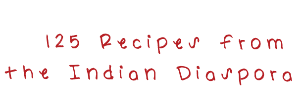


The stamp treatment nods to the paperwork of immigration: the approvals and permissions tied to citizenship. Against it, the handwritten Carolyn typeface for the body text brings a personal voice, like notes passed down in the author's own hand.
03 the stain
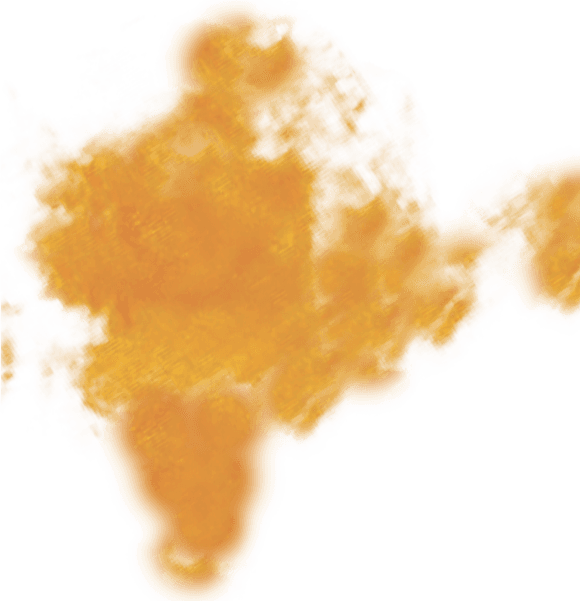
Shaped like India, the stain reads as a literal mark of origin. But it also calls back to the stained shirts and cloth that once made kids feel like outsiders growing up. Reclaimed here, that same mark now stands for something else: culture, memory, and a life lived in color.
04 the spilled lentil

Spilled lentils bring the design back down to earth. Dal is a staple on every Indian table, and the mess of it signals a kitchen that's alive and in use, not staged for a photo.
amrikan
AMRIKAN
01 the TITLE
02 the Typography
03 the stain
04 the spilled lentils
American" gets corrected to "Amrikan," the way the word actually comes out when spoken at home. That gap between spelling and sound is the same one immigrant kids grow up navigating, caught between two versions of belonging.
The stamp treatment nods to the paperwork of immigration: the approvals and permissions tied to citizenship. Against it, the handwritten Carolyn typeface for the body text brings a personal voice, like notes passed down in the author's own hand.
Shaped like India, the stain reads as a literal mark of origin. But it also calls back to the stained shirts and cloth that once made kids feel like outsiders growing up. Reclaimed here, that same mark now stands for something else: culture, memory, and a life lived in color.
Spilled lentils bring the design back down to earth. Dal is a staple on every Indian table, and the mess of it signals a kitchen that's alive and in use, not staged for a photo.
the final product
05 book jacket


06 book interpretation

Photography vs. illustration
Original: playful, iconic illustration.
Reinterpretation: a turmeric stain and scattered lentils as tactile evidence of real cooking.
Flat color vs. textured color
Original: flat printed yellow and pink, evenly applied.
Reinterpretation: a deep red field and a turmeric stain, both with visible texture and material weight rather than flat color.
Result vs. correction
Original: "AMRIKAN" presented as a settled title.
Reinterpretation: "AMERICAN" caught mid-correction, showing the reclaiming itself.
Graphic vs. editorial
Original: bold design built for shelf presence.
Reinterpretation: an intimate feel, more like a stained recipe card.

the brief
ONE TITLE, TWO WAYS TO SAY IT
Full jacket redesign for a novel about immigration and identity. "American" gets corrected to "Amrikan," the way the word actually comes out spoken at home. That gap between spelling and sound is the same one immigrant kids grow up navigating, caught between two versions of belonging.
Full jacket redesigns across fiction, nonfiction, and culinary editorial. Each cover needed its own authored language, not a house style stretched across every title.
THe problem
LITERAL READS SAFE, NOT MEMORABLE
The easy move is illustrating what the book is about. That reads as commercial default and gets lost on a shelf or at thumbnail size.
The Insight
LET THE ACCENT DO THE TALKING
The strongest covers carry a book's emotional register, not its plot. Concept first, then type, then image, restraint doing more work than decoration.
the brief
Four titles, four visual worlds
Full jacket redesigns across fiction, nonfiction, and culinary editorial. Each cover needed its own authored language, not a house style stretched across every title.
THe problem
Literal reads safe, not memorable
The easy move is illustrating what a book is about. That reads as commercial default and gets lost on a shelf or at thumbnail size.
the insight
Embody the book, don't describe it
The strongest covers carry a book's emotional register, not its plot. Concept first, then type, then image, restraint doing more work than decoration.
WARM, MODERN, ROOTED IN CRAFT
Concept Before Illustration
Distinct Voice Per Title
ONE OWNABLE SYMBOL
Reads at Thumbnail Size
Concept Before Illustration
LEGIBLE IN LIGHT & DARK
Distinct Voice Per Title
Reads at Thumbnail Size
SCALABLE ACROSS PRINT, PACKAGING, SIGNAGE
Full Jacket System
ACCENT OVER ILLUSTRATION
Reads at Thumbnail Size
SPELLING AS CONCEPT
Full Jacket System
01 The title
American" gets corrected to "Amrikan," the way the word actually comes out when spoken at home. That gap between spelling and sound is the same one immigrant kids grow up navigating, caught between two versions of belonging.
02 the typography
The stamp treatment nods to the paperwork of immigration: the approvals and permissions tied to citizenship. Against it, the handwritten Carolyn typeface for the body text brings a personal voice, like notes passed down in the author's own hand.
03 the stain
Shaped like India, the stain reads as a literal mark of origin. But it also calls back to the stained shirts and cloth that once made kids feel like outsiders growing up. Reclaimed here, that same mark now stands for something else: culture, memory, and a life lived in color.
04 the spilled lentil
Spilled lentils bring the design back down to earth. Dal is a staple on every Indian table, and the mess of it signals a kitchen that's alive and in use, not staged for a photo.
amrikan
AMRIKAN
01 the TITLE
02 the Typography
03 the stain
04 the spilled lentils
American" gets corrected to "Amrikan," the way the word actually comes out when spoken at home. That gap between spelling and sound is the same one immigrant kids grow up navigating, caught between two versions of belonging.
The stamp treatment nods to the paperwork of immigration: the approvals and permissions tied to citizenship. Against it, the handwritten Carolyn typeface for the body text brings a personal voice, like notes passed down in the author's own hand.
Shaped like India, the stain reads as a literal mark of origin. But it also calls back to the stained shirts and cloth that once made kids feel like outsiders growing up. Reclaimed here, that same mark now stands for something else: culture, memory, and a life lived in color.
Spilled lentils bring the design back down to earth. Dal is a staple on every Indian table, and the mess of it signals a kitchen that's alive and in use, not staged for a photo.
the final product
05 book jacket
06 book interpretation
Photography vs. illustration
Original: playful, iconic illustration.
Reinterpretation: a turmeric stain and scattered lentils as tactile evidence of real cooking.
Flat color vs. textured color
Original: flat printed yellow and pink, evenly applied.
Reinterpretation: a deep red field and a turmeric stain, both with visible texture and material weight rather than flat color.
Result vs. correction
Original: "AMRIKAN" presented as a settled title.
Reinterpretation: "AMERICAN" caught mid-correction, showing the reclaiming itself.
Graphic vs. editorial
Original: bold design built for shelf presence.
Reinterpretation: an intimate feel, more like a stained recipe card.